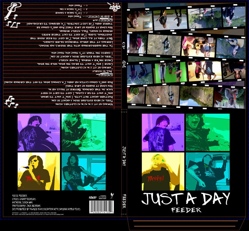


The final digipak adds to the video as it focuses on the fun that the video has as well as emphasises the concept that all of this happens in ‘just a day’, using doodles, home scene locations and the reams of film footage lying around with behind the scenes stills in them. The colour scheme of the front and back covers also ties into the poster and thus makes this a cute little package.


We then experimented with placing the title over the images in the middle, over the images in the bottom/top corners, above the image and finally settling on below the image. We also decided that, as we were advertising this as a single that 'Just a Day', the name of the song, should go before 'Feeder', the name of the band as it was more relevent to the product.
Going with the research we had done into the band, other digipaks and CD/DVD covers we came up with a few ideas:

We want to continue the idea of this being 'homemade' by fans on the inside - maybe having handwritten elements?
We also found a website (http://www.duplication.ca) that gave a few templates for digipaks. We have decided to do a simple two fold digipak (for two disks) in order to hold a music CD and the DVD of the video and any extras. This site provides templates for this as well as three fold digipaks. Here is the template for the digipak we intend to create:
http://www.duplication.ca/dl/digipak4p.pdf
We do, however, intend to modify this design in order for it not to accommodate a plastic cd holder. Instead we intend to make a slip for the disks to be inserted into, like the Pink Greatest Hits…So Far digipak.
In our research we did find another blog stating this:
DigiPak/CD Covers should contain:
[http://snc-a2media09-ckenworthy.blogspot.com]
We intend to do our best to recreate these elements.
 Here is a more elaborate form of digipak, featuring an outer casing as well as the structured inside disk folders. This has a strong atmosphere and idea behind it, giving strong messages of the type of content it holds. There is a monochromatic colour scheme that is heavily photoshopped. This may be too elaborate for our product, but the simplicity of it has a strong impact.
 This is the simple four panel digipak. It has an iconic symbol instead of an image and gets across the meaning and atmosphere to the audience/reader. It also uses complimentary colours although there are more than the usual 2 or 3. The image on the CD is strong and could be another reason to try do this in our digipak. The simplicity mixed with the detail in this product makes it strong and memorable. The idea of using heavy photoshop techniques on the photograph picture (the boy) also gives this digipak a modern, artistic edge.

GOOGLE DIGIPAK 1
This digipak uses more images, but has the same simple colour scheme as others. The CD also fits nicely into the packaging with the printing over the top. This digipak also has sleeves in which flyers and even disks could be placed - all the extras - which could be a interesting idea to play with.

DISTORTURE; REVERE

PEARL JAM; SELF-TITLED
This cover is very simple and also includes iconic images. It uses only two main colours and an avocado. The symmetry between the avocado at the front and back is interesting and something we might explore. It gives the atmosphere of the album and hints at the disposition of the band.

This album has a high continuity with House Style, using only three colours (pink, white and grey) to create their product. It also uses iconic images that are strong and give us an idea of what Pink's music is like and what the album is alike as well - edgy, angry, sombre, pink.
We have decided to do a digipak surrounding the single of ‘Just A Day’ instead of a whole album as the original video was a big success upon production. However, it should be marketed as renewed as we have a new concept that links strongly to the old one and thus can be seen as a re-vamp of the old video. We want it to encompass the fun that the video achieves as well as remain professional and seen as a Collector’s Edition-esque product.
We could include: